
Museum of Fine Arts Boston
MFA Boston is an open minded museum, in regards to the art it houses, showcasing 500,000 works of art, with a mix of modern pieces, and ancient artistry. MFA Boston is best known for its general attitude towards open mindedness, and its massive permanent collection. This project was a fictitious ad campaign to change up
the demographic of the people who usually visit the museum a bit and attract other groups of people to attend more often. The current demographic of people attending this museum is that 67% of visitors were female, 75% of visitors were over the age of 45, and 79% of visitors identified as Caucasian.
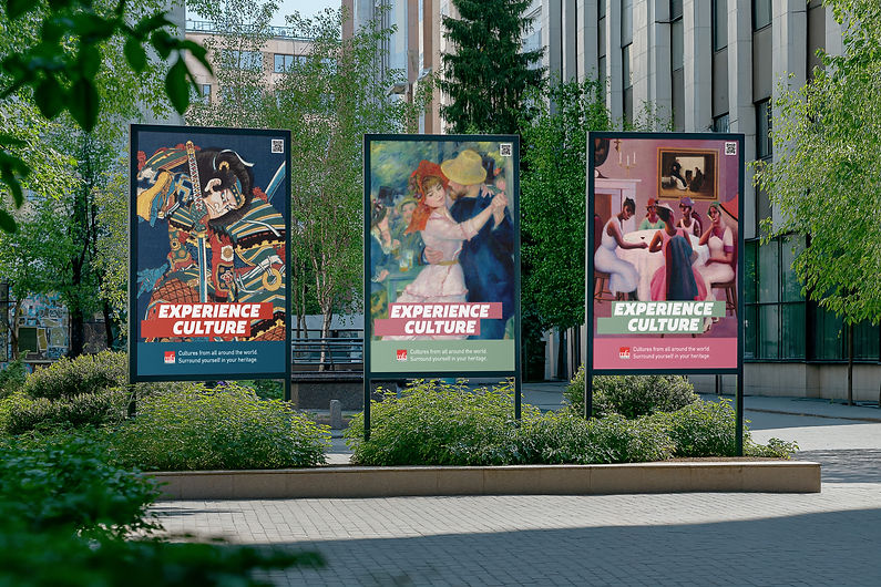
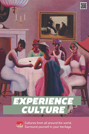
The imagery used was chosen to catch the attention of people passing by, either due to the color, or due to the eye contact created by the posters, using art pieces shown in the museum. The bright colors are to catch the eye of a younger audience, and the different cultures each poster represents shows that the museum will have a little bit of something for everyone's interests.
Logos
Official Logo
Colors
This project does not actually have a set color palette for the advertising campaign. Instead, the colors used were color picked from different areas of the paintings, creating a matching palette for each advertisement, and creating a variety of designs, keeping each ad different from the next.
Typefaces

HeadlineTypeface

Body Typeface

Campaign Assets Applied
Simple layouts, using colors found within each of the images used in the promotional materials, and using a modified version for each different type of promotional material allows for an overall uniform look, with a simple call to action and a sentence to go along with it. This campaign could even be extended past it's original form, as it is relatively template based. This has the potential to showcase even more cultures.

I wanted to use the selling point that relates to heritage with this specific campaign. Every story is unique, and so is the museum’s. Using this selling strategy, the museum can become more interesting to someone who would otherwise just ignore museum advertisements and promotional material. Using Photoshop and Illustrator, I created mock-ups that help portray what these ads could look like and apply them to different areas. The main point here is to appeal to someone who may not expect a piece of/from their culture to be on display at the museum, and entice them to come and learn more about the culture they identify with.


Poster Ads & Mockup
Made with Illustrator and Photoshop


Mobile Ad Mock-Ups
Made with Illustrator and Photoshop


Web Banner Ads
Made with Illustrator
Working on this project allowed me to really see just how many styles of advertising selling points there are. I originally picked 3 different solutions to help increase the diversity of the museum. These solutions were to appeal to Heritage, showcasing that every story is different, Knowledge, demonstrating the knowledge held by the target audience, or only showing the "After", when the “after” is what is accentuated. I decided appealing to the Heritage point was the best way to move forward, and appeal to a large segment of people.